


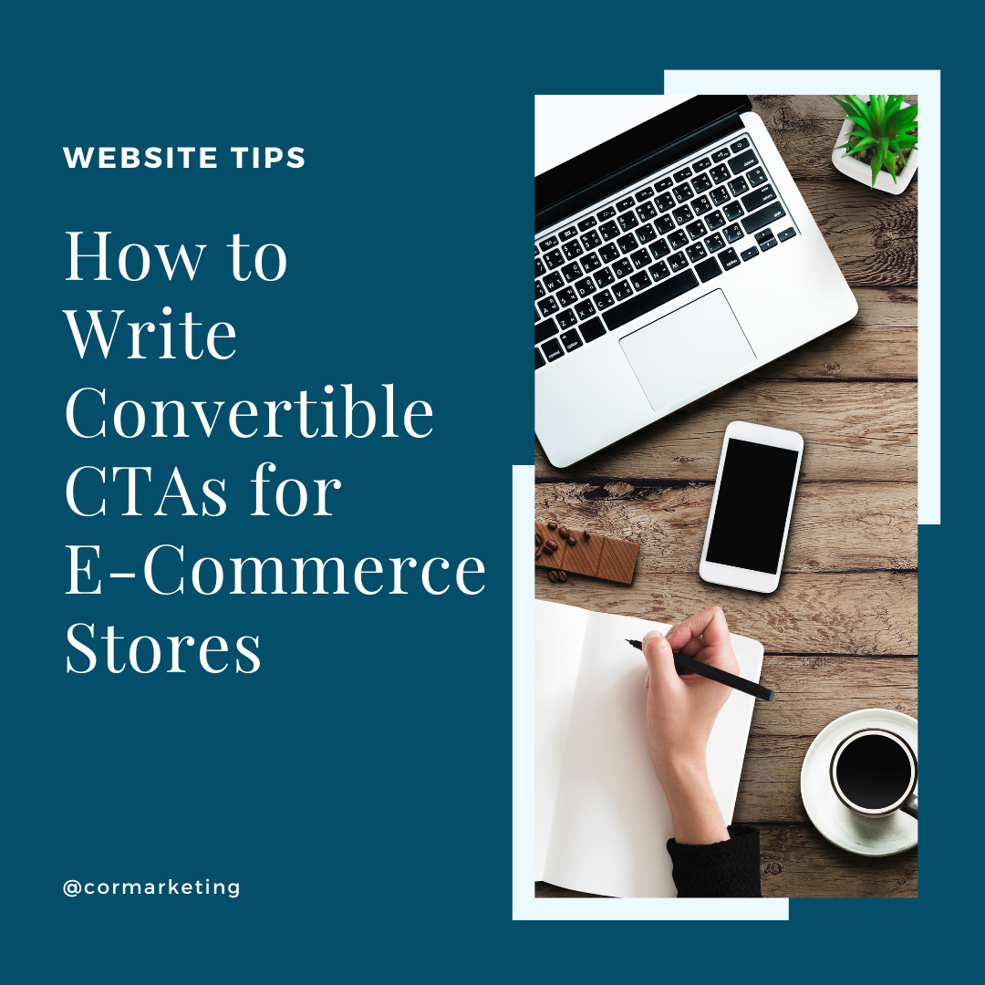
It’s frustrating when you spend hours making sure your online store looks flawless, but you’re still not getting conversions. Despite all the time you’ve spent optimizing the design and the content, people still aren’t adding your products to their cart.
So what’s the problem? It may have something to do with your call to action buttons.
The call to action, or CTA, on a web page simply instructs visitors on what to do. It essentially works as a light that illuminates the path to buying your product. You see CTAs on websites all the time, most obviously perhaps with a “Buy Now” button.
There is no magical word or design element that will instantly turn your visitors into buyers. To find the right CTA for your site and your products, you have to test out to determine what will connect the most with your target shoppers. However, there are certain basic things to keep in mind to make your ecomm CTA more convertible.
One of the most effective ways to increase conversion rates is to create a sense of urgency. When shoppers think that an opportunity is limited, they are more motivated to buy. You can see this in action when you consider end-of-season sales. You might do this by saying, “On sale — only until midnight tonight!”
A case study by the team at ConversionXL shows that by adding a sense of urgency to their product, they were able to increase their conversion rate by 332%. That’s what any store owner wants to see!
First, make sure that your CTA appears as a separate button, not just text. There are many studies that show that buttons are the best bet for directing visitors to check out. The text on this button should also be simple. Something like “Buy Now” works great.
Comments will be approved before showing up.


Online Store 2.0 opens up huge opportunities for developers to be able to successfully build themes and apps for Shopify merchants.
Shopify has rebuilt the online store experience that includes new features and a new set of developer tools, for a smooth editing experience for merchants and a pleasant experience for shoppers. Not to mention the new reference theme Dawn, is 35% faster!